Interpreting Intervention Model Results
Impact Analysis
Impact analysis results display the treatment impact for:
Historically Treated Population: The impact of the intervention on those who actually received it
Entire Model Population: The impact of the intervention if the entire population received it
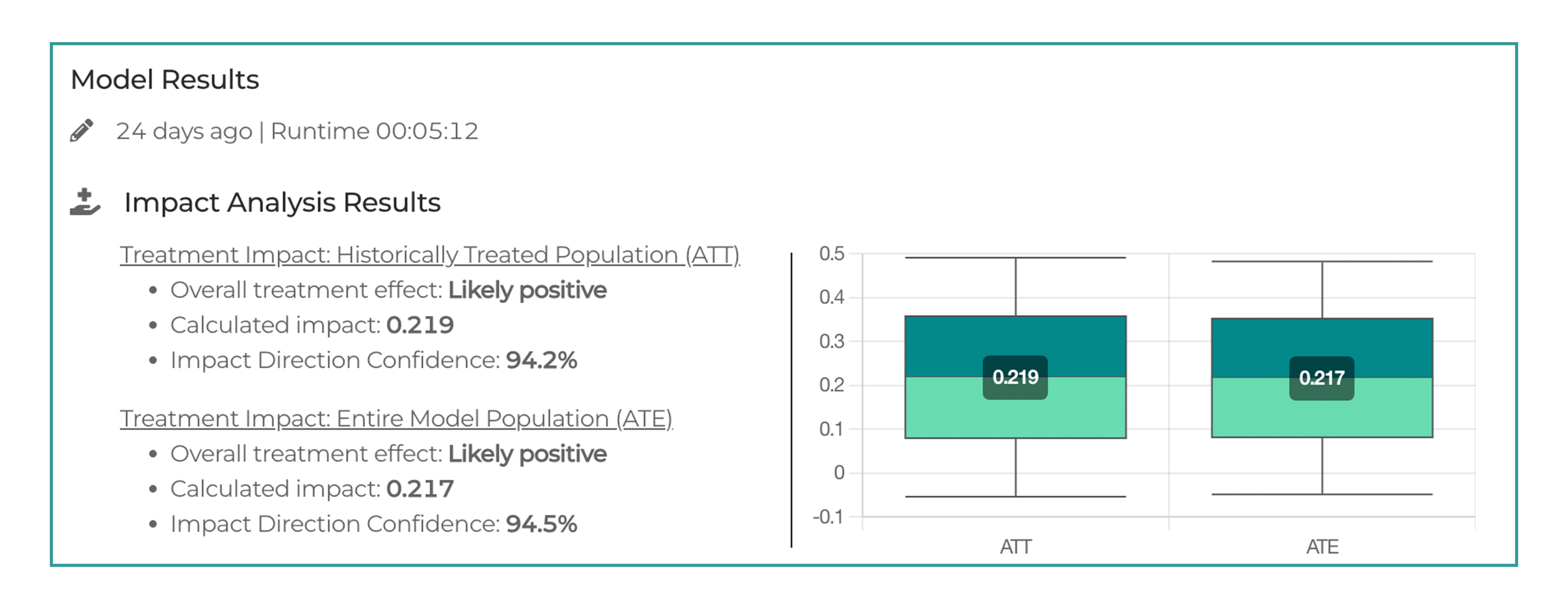
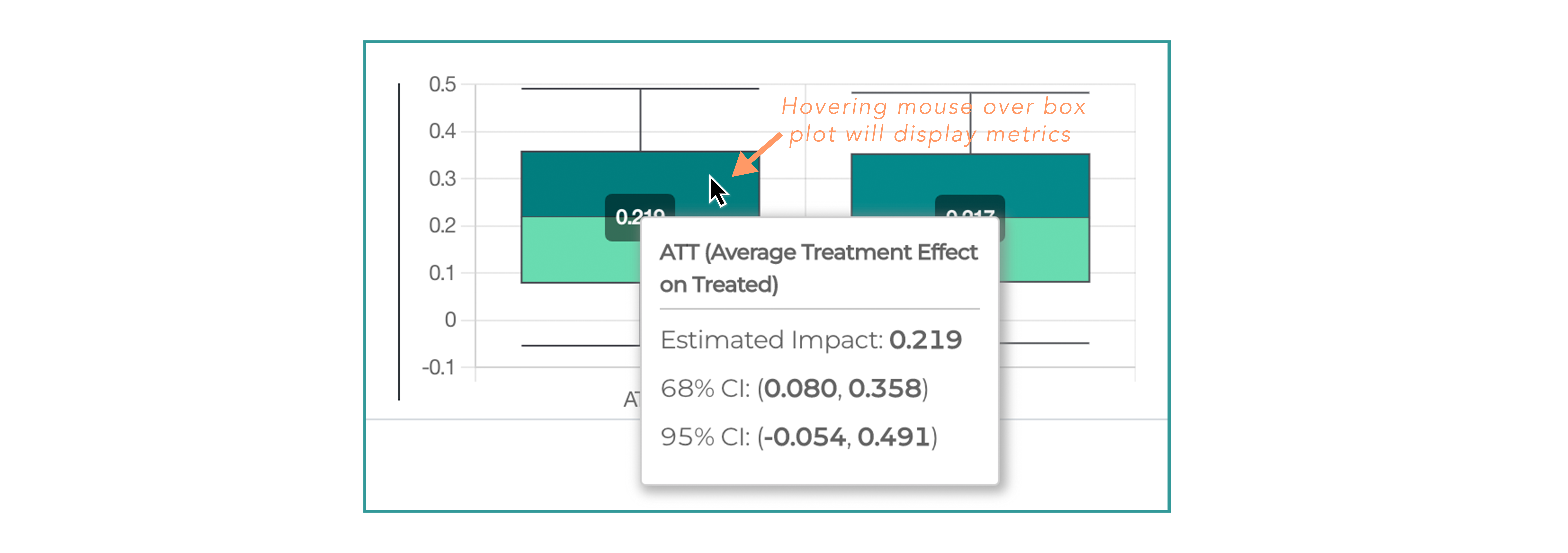
Note: The key difference is that the box and whisker plot shows the range of values which we have 95% confidence that the ATE / ITE might take, while the confidence percentage is the percent of the range of possible ATE / ITEs that fall above 0.
Impact analysis results are summarized in two box-and-whisker charts:
– Treatment Impact on the Treated Population (ATT): Average Treatment effect on Treated
– Treatment Impact on the Entire Model Population (ATE): Average Treatment Effect
Targeting Analysis
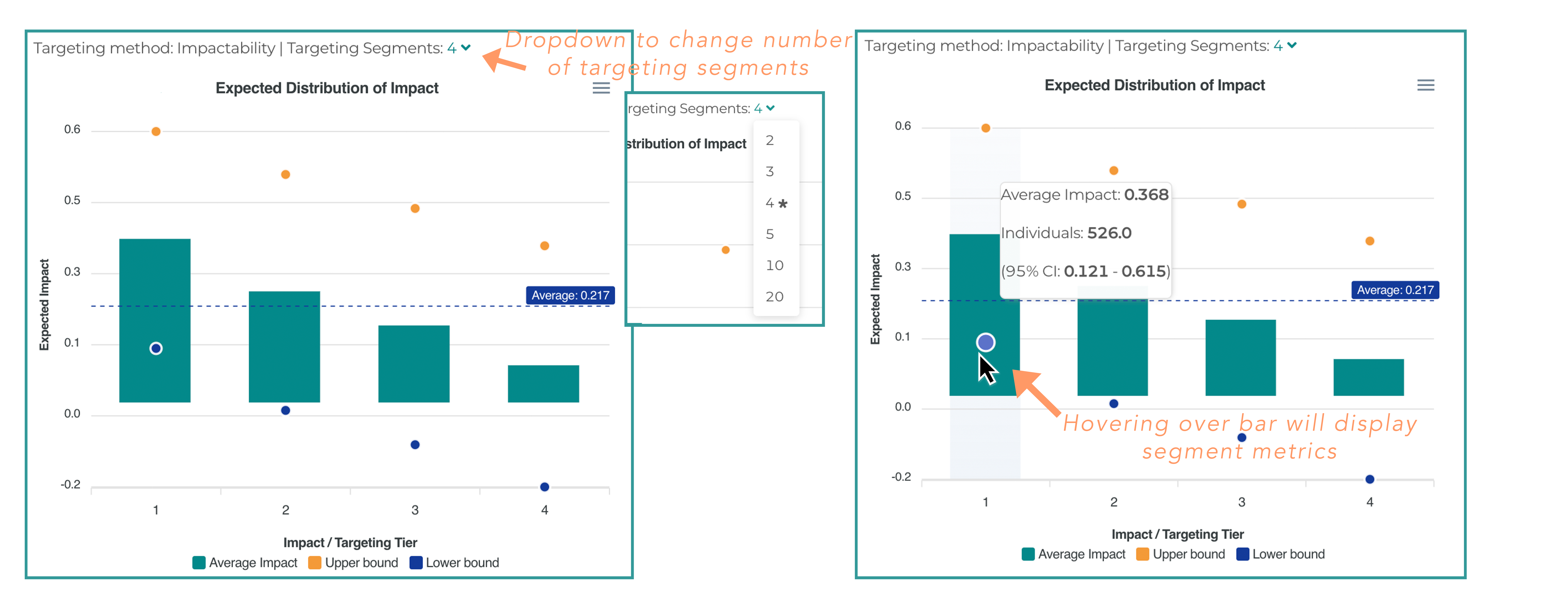
The impactability model predicts the expected conditional average treatment effect (CATE) / impact for every individual. The chart above displays CATE pooled into targeting segments of equal size. Changing the number of targeting segments in the dropdown at the top of the chart changes the number of displayed targeting segments. You can select 2, 3, 4, 5, 10, or 20 tiers.
The Y axis of the chart represents the average reduction of the modeling outcome (e.g. risk of an acute event or a level of A1C) as a result of an intervention.
Orange and blue dots show a 95% confidence interval for the treatment effect of the whole segment.
You can see all the relevant metrics/numbers if you hover over each bin, including the number of individuals in the holdout set of the model who fell into that particular tier.
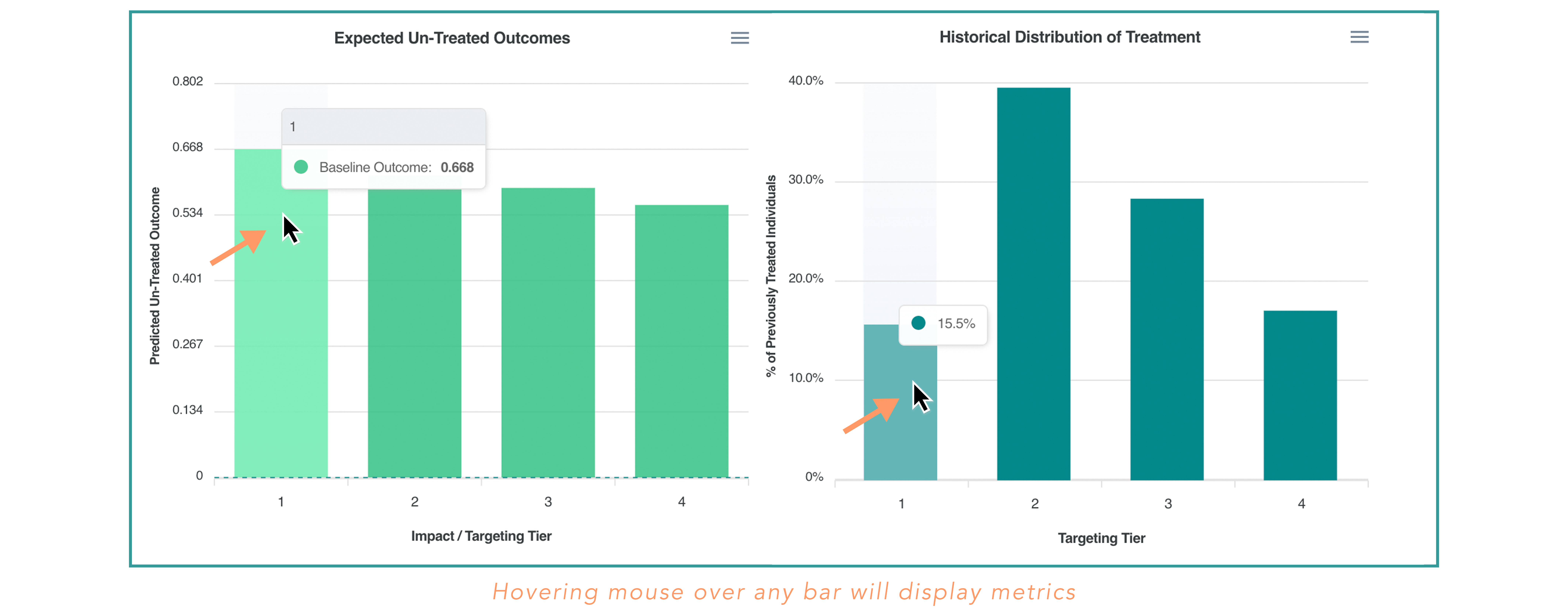
The Expected Un-Treated Outcomes chart shows the average expected outcome rate for non-treated individuals by segment. This is a baseline level, to which the actual reduction/treatment effect is being applied.
– If the average baseline of the segment is 0.668, and expected impact is 0.368, then the expected average outcome after treatment/intervention is 0.4.
The Historical Distribution of Treatment chart will show how the historical treatment assignment was distributed across the segments defined by the model.
– If the first tier has the largest percentage of the historical treatment records and the last tier has the lowest, our model recommendation is consistent with how the treatment assignment was done before. If they are distributed equally, our new segmentation strategy is entirely orthogonal to what has been done historically.
Differentiating Features
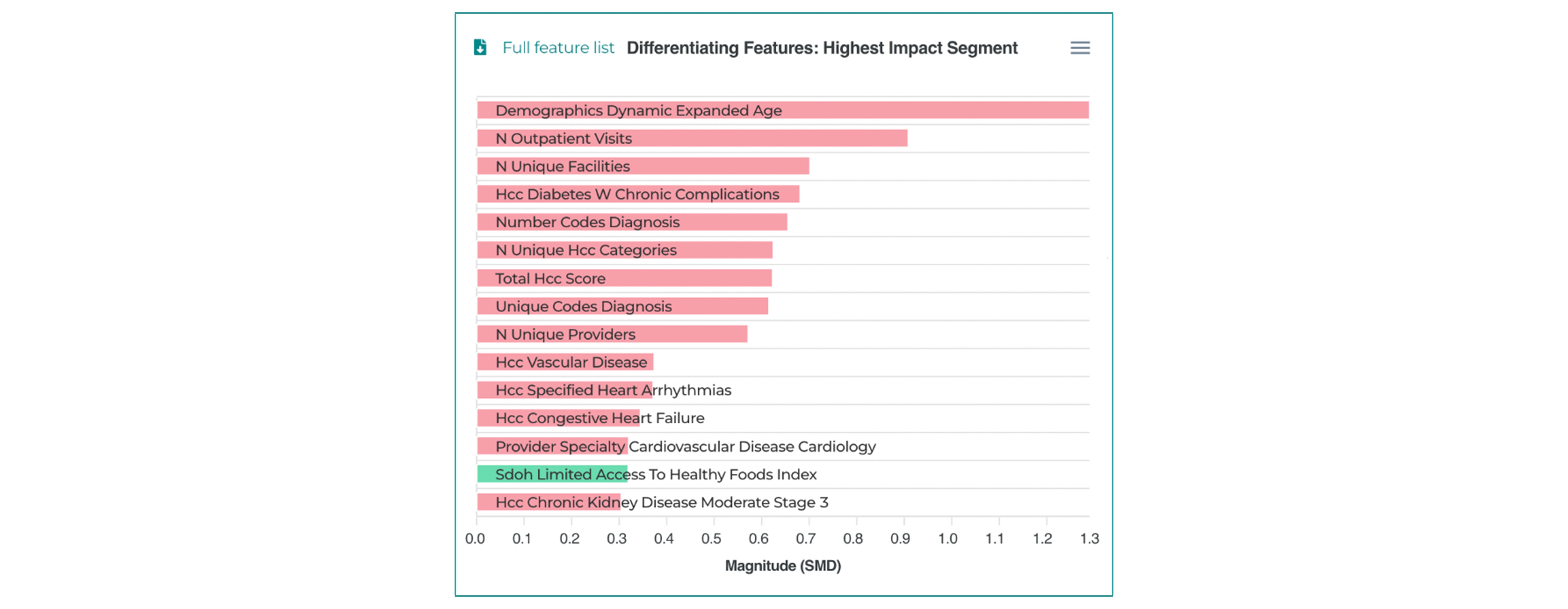
The Differentiating Features chart shows the Standardized Mean Difference (SMD) of features between the top impact segment and the rest of the segments.
– The top features are those with the most significant difference in value between the top targeted impact segment and the rest of the cohort.
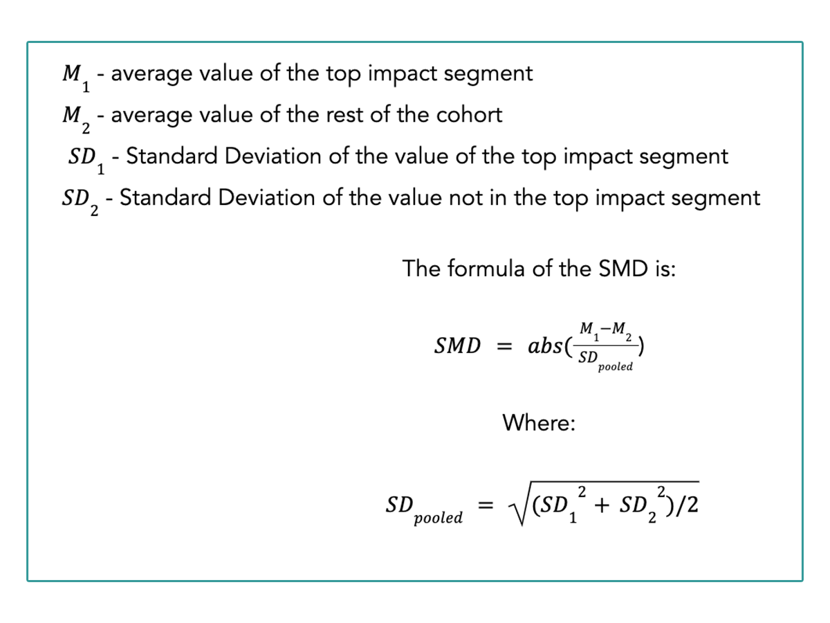
– Standardized Mean Difference is the absolute difference between the average value of the feature of two segments (top vs rest) normalized by the pooled variance of the feature.
– In the example above, we can see that the top feature is Age, indicating that the age of the top impact segment is very different than the rest of the population.
The Standardized Mean Difference formula is explained below.
The color of the bars represents the direction of the correlation between the feature values and the outcomes.
– Green indicates a positive correlation
– Red indicates a negative correlation
In the example above, the bar representing the top feature (Age) is red, indicating that the highest impact is associated with the younger population.
Updated almost 2 years ago
