Interpreting Risk Model Results
Risk Models
The Curia platform distinguishes two types of risk models: binary classification and regression. They have separate sets of charts that visually represent validation results.
Binary Classification
The Curia platform distinguishes two types of risk models: binary classification and regression. They have separate sets of charts that visually represent validation results.
Validation results charts show how well those risk scores predict the outcome on a sample of a holdout dataset.
The platform presents the following charts:
- Receiver Operating Characteristic (ROC) Curve
- Precision/Recall Curve
- Predicted Risk vs. Actual Outcome
- Differentiated Features: high-risk response
Receiver Operating Characteristic (ROC) Curve
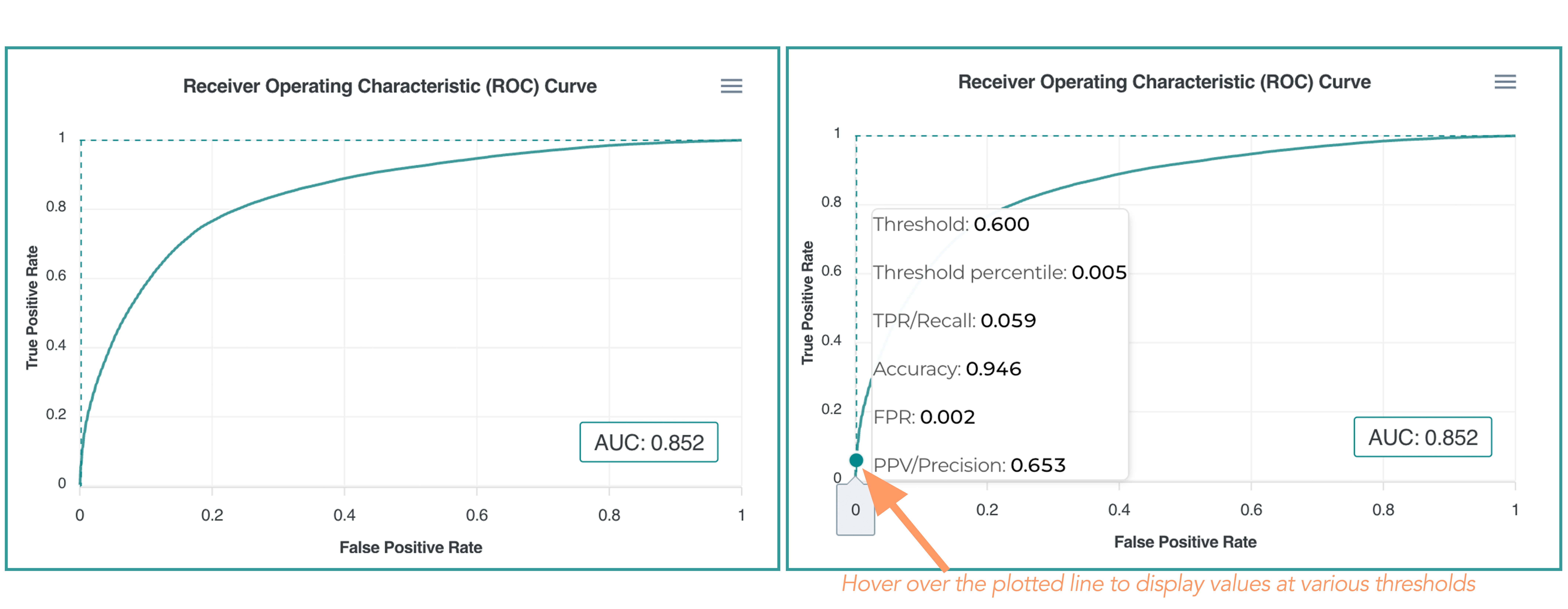
A ROC curve is a commonly used way to visualize the performance of a binary classification model with two possible output classes. It dynamically displays the True Positive Rate (Sensitivity) on the y-axis and the False Positive Rate (1 – specificity) on the x-axis as the risk threshold value shifts from 1 down to 0.
- True Positive Rate (Recall or Sensitivity): The number of True Positives (TP) divided by the number of all positives (TP+FN).
- False Positive Rate (Specificity): The number of False Positives (FP) divided by the number of all negatives (TN+FP)
- Area Under the ROC Curve (AUC): The area below the ROC curve line. AUC equal to 1 would indicate a perfect classification model (and likely data leakage). An AUC of .5 would indicate that the model’s ability to assign scores is equivalent to chance.
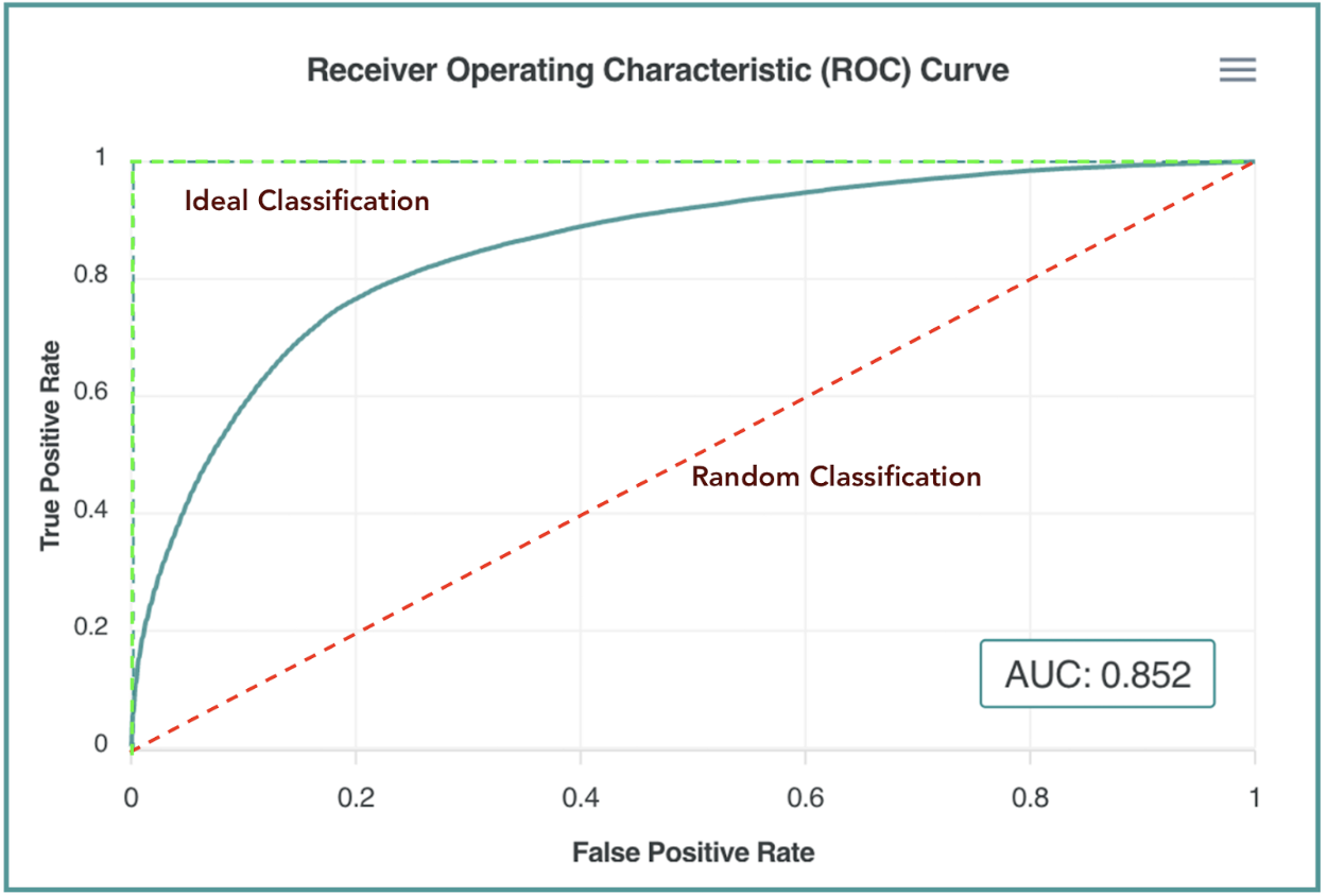

We categorize the AUC ranges as follows:
| AUC Value | Category |
|---|---|
| Above 0.99 | Perfect AUC, possible data leakage |
| 0.9-0.99 | Excellent |
| 0.8-0.9 | Very Good |
| 0.7-0.8 | Good |
| 0.6-0.7 | Satisfactory |
| 0.5-0.6 | Unsatisfactory |
Precision/Recall Curve
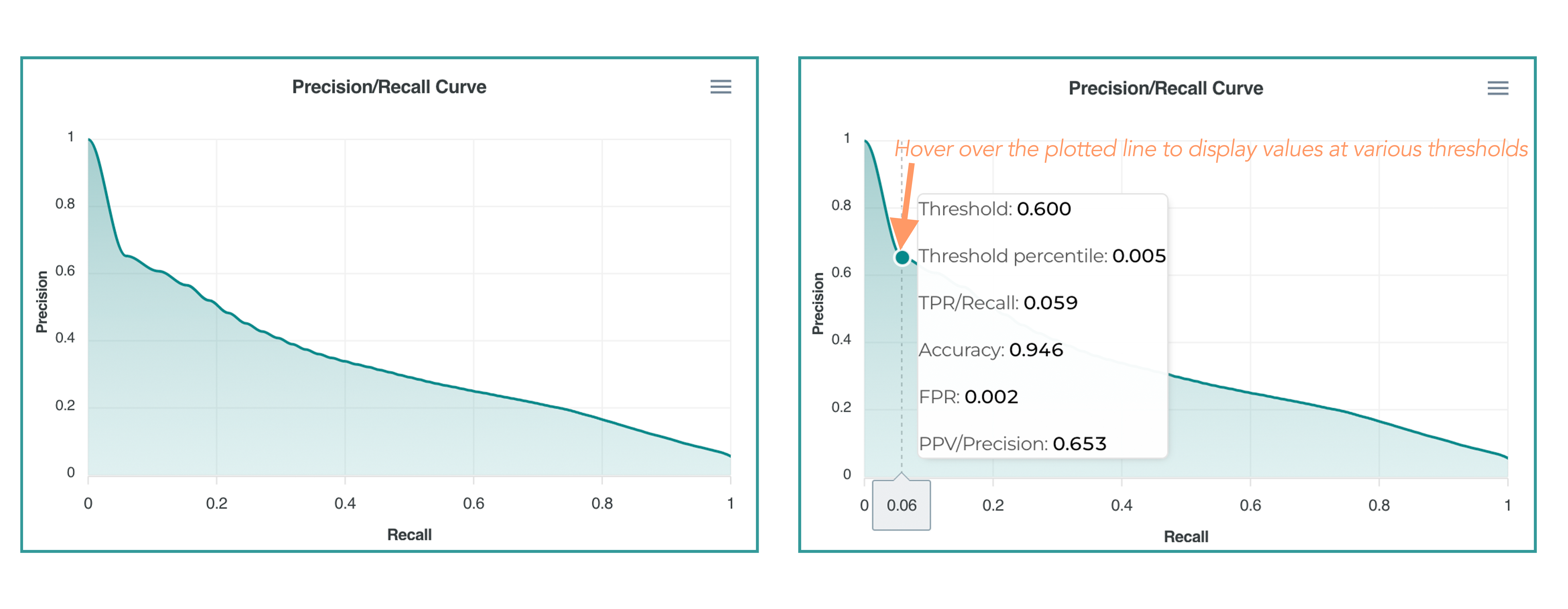
There is always a tradeoff between Precision (aka Positive Predictive Value, % of people we target with a positive outcome) and Recall (% of people we cover out of all the positive outcomes possible) when choosing a targeting risk threshold.
Predicted Risk vs. Actual Outcome
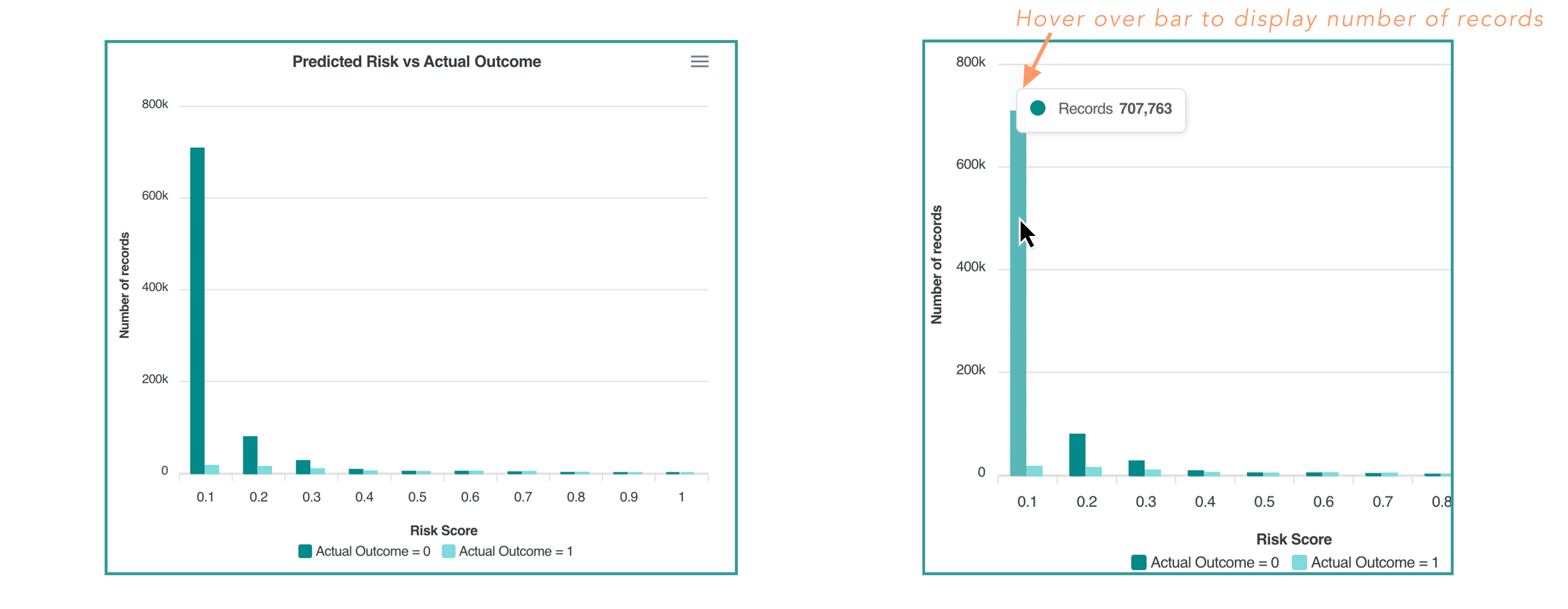
This chart presents a distribution of the risk scores by deciles from 0 to 1. You can individually view risk scores for positive and negative outcomes. Typically you would expect the ratio to increase as you move from 0 to 1 on the X-axis.
Differentiating Features: Highest Risk Segment
Regression Model
The Regression model predicts a continuous outcome (ex. Total Cost of Care, A1C level, Number of ED visits or Hospitalizations per year, etc.). The platform predicts the expected value for the outcome.
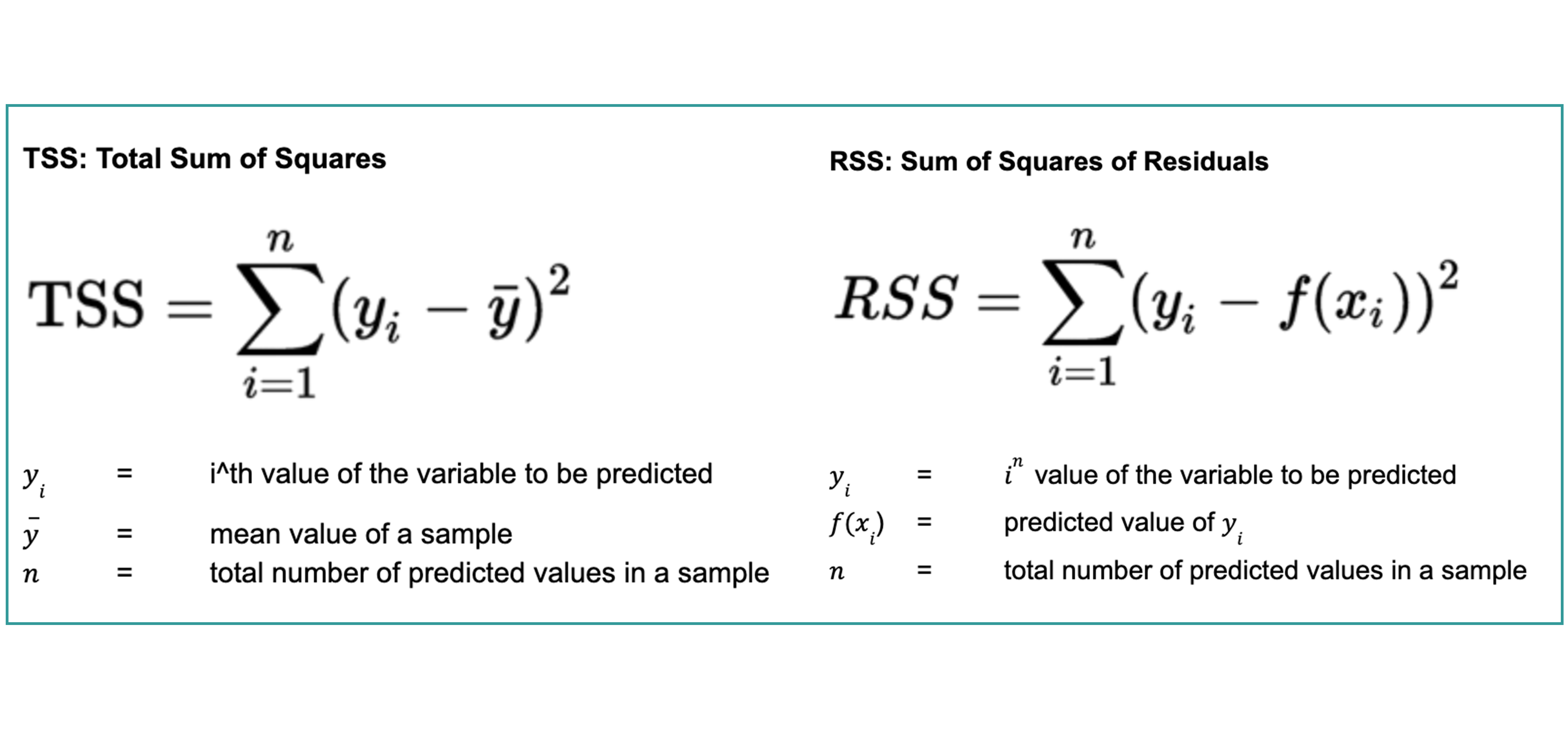
The primary metric for regression models is R^2 (coefficient of determination). It reflects how well the model explains the variance in the population’s outcome distribution.

Predicted Value vs. Actual Value
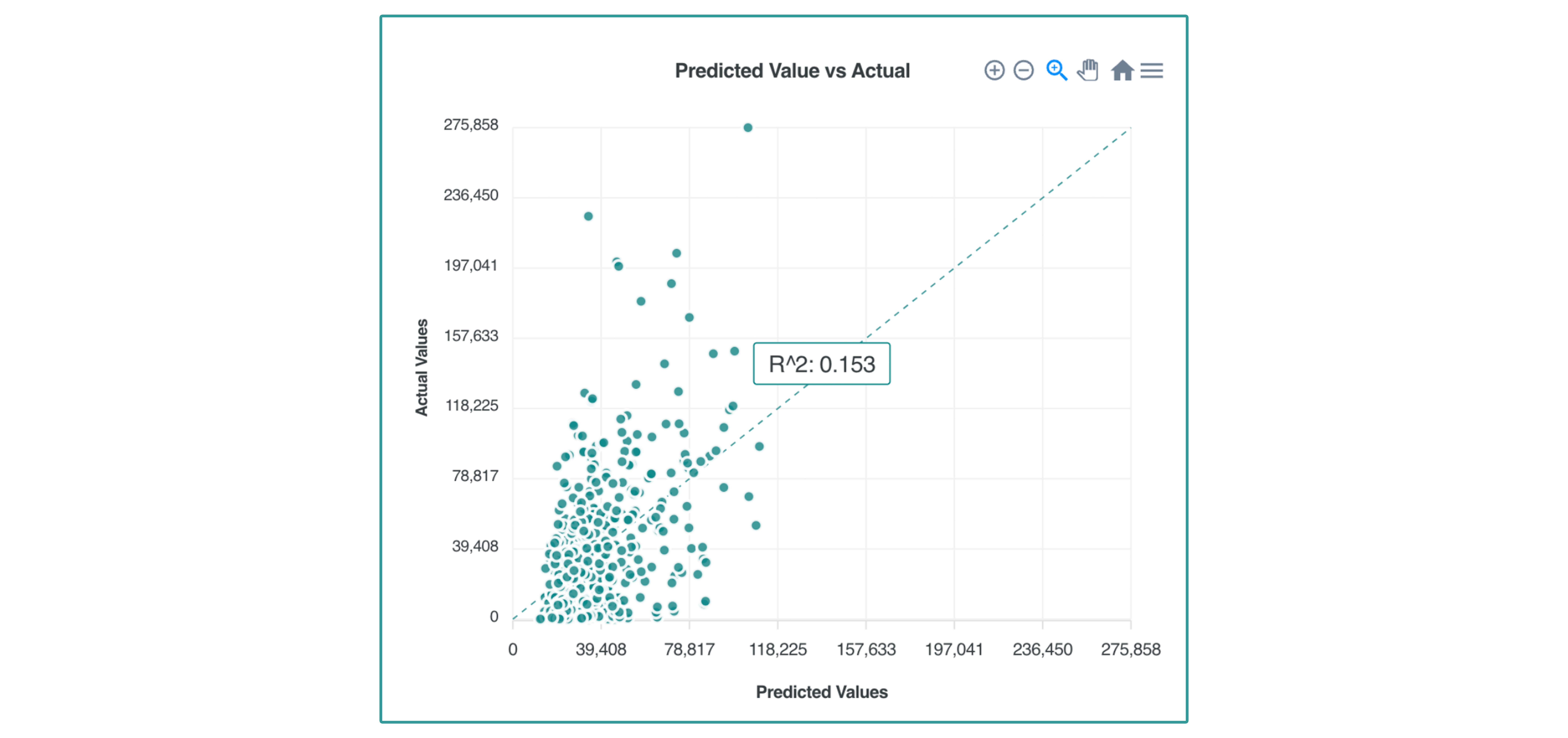
The scatterplot of Predicted Values vs. Actual Values shows a unit-by-unit comparison of predicted values (X-axis) vs. actual values (Y-axis).
The regression line shows the relationship between predicted and actual values. The X and Y axis have the same scale. Ideally, the regression line should be a perfect diagonal line between two corners.
Bin View of Predicted/Actual
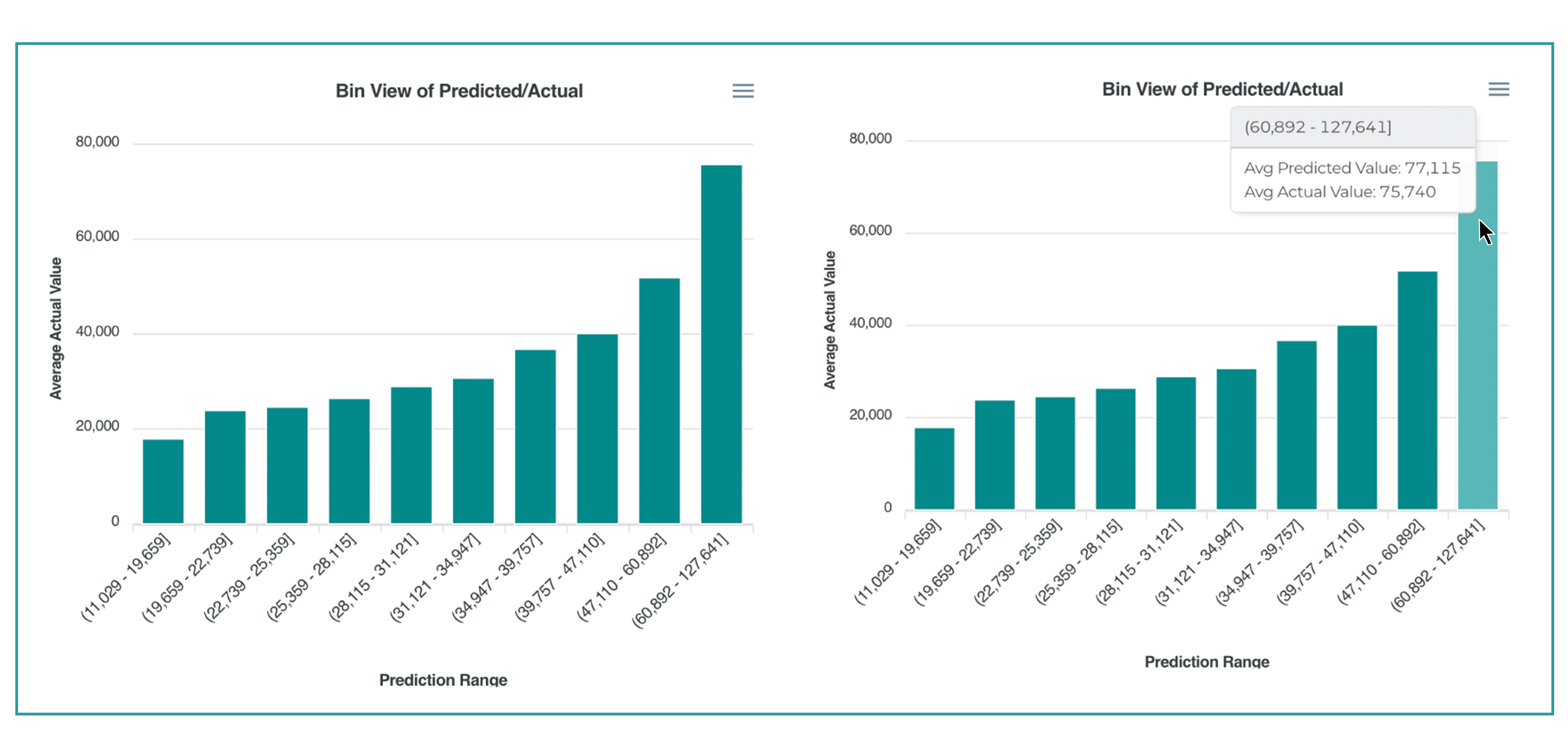
This chart displays the average predicted value vs. average the actual value pooled by deciles. You can see a range of predicted values and a comparison of the average predicted value to the average actual value for the holdout sample.
Updated over 1 year ago
